library(data.table)
library(grid)
library(gtable)
library(ggplotify)
library(ggplot2)
library(methods)
library(RColorBrewer)
library(aplpack)RplotterPkg Examples
The goal of RplotterPkg is to provide easy access to the many ggplot2 geom plotting routines for everyday use. The package uses a functional approach along with the fast, efficient data frame processing from data.table.
Installation
For the following examples, install the development version of RplotterPkg from GitHub with:
Using pak::pak():
pak::pak("deandevl/RplotterPkg")
Using devtools::install_github():
devtools::install_github("deandevl/RplotterPkg")
Setup
In addition, load the required R script libraries from CRAN.
Standard Plotting
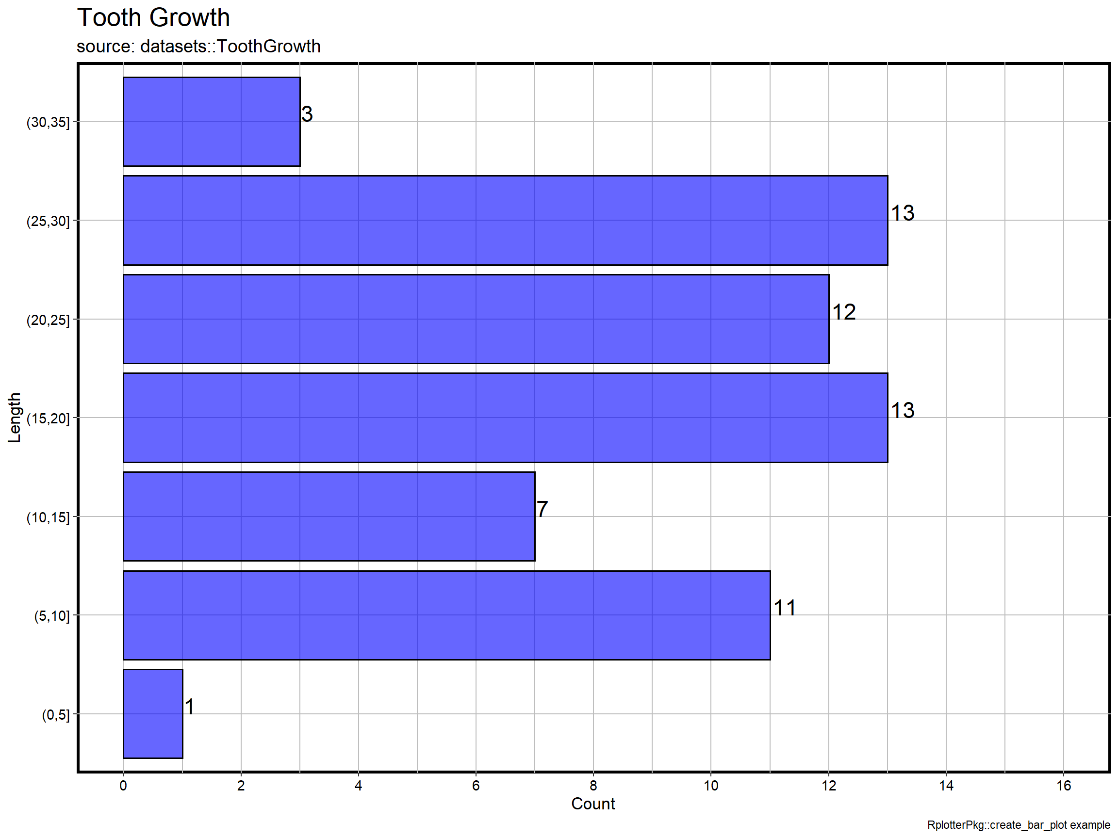
RplotterPkg offers many of the standard plotting such as scatter, box, density, histogram, range, heatmap, and stick plots. The following example shows how easy it is to assign an x axis variable and label for a bar plot.
RplotterPkg::create_bar_plot(
  df = datasets::ToothGrowth,
  aes_x = "len",
  x_major_breaks = seq(from = 0, to = 40, by = 5),
  y_major_breaks = seq(from = 0, to = 16, by = 2),
  y_limits = c(0, 16),
  bar_labels = TRUE,
  bar_fill = "blue",
  bar_alpha = 0.6,
  bar_label_sz = 6,
  do_coord_flip = TRUE,
  rot_y_tic_label = TRUE,
  title = "Tooth Growth",
  subtitle = "source: datasets::ToothGrowth",
  x_title = "Length",
  y_title = "Count",
  caption = "RplotterPkg::create_bar_plot example"
)
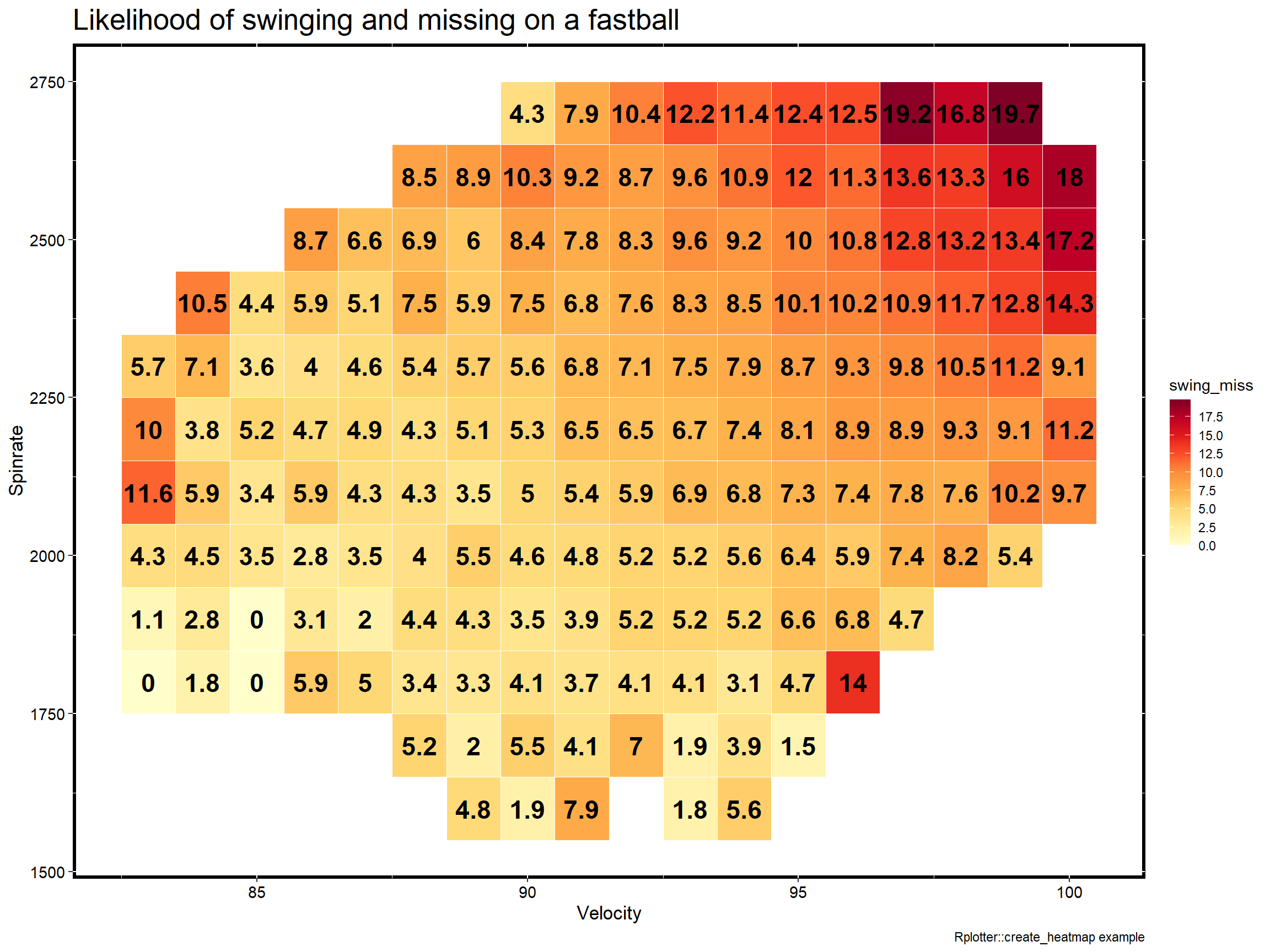
Creating a minimal heatmap just requires assigning a dataframe along with column names for the x/y axis’ and a dependent variable.
RplotterPkg::create_heatmap(
    df = RplotterPkg::spinrates,
    aes_x = "velocity",
    aes_y = "spinrate",
    aes_fill = "swing_miss",
    aes_label = "swing_miss",
    label_fontface = "bold",
    title = "Likelihood of swinging and missing on a fastball",
    x_title = "Velocity",
    y_title = "Spinrate",
    rot_y_tic_label = TRUE,
    caption = "Rplotter::create_heatmap example"
  ) +
  ggplot2::scale_fill_gradientn(
    colors = RColorBrewer::brewer.pal(n = 9, name = "YlOrRd"),
    n.breaks = 8
) 
Additional Plotting
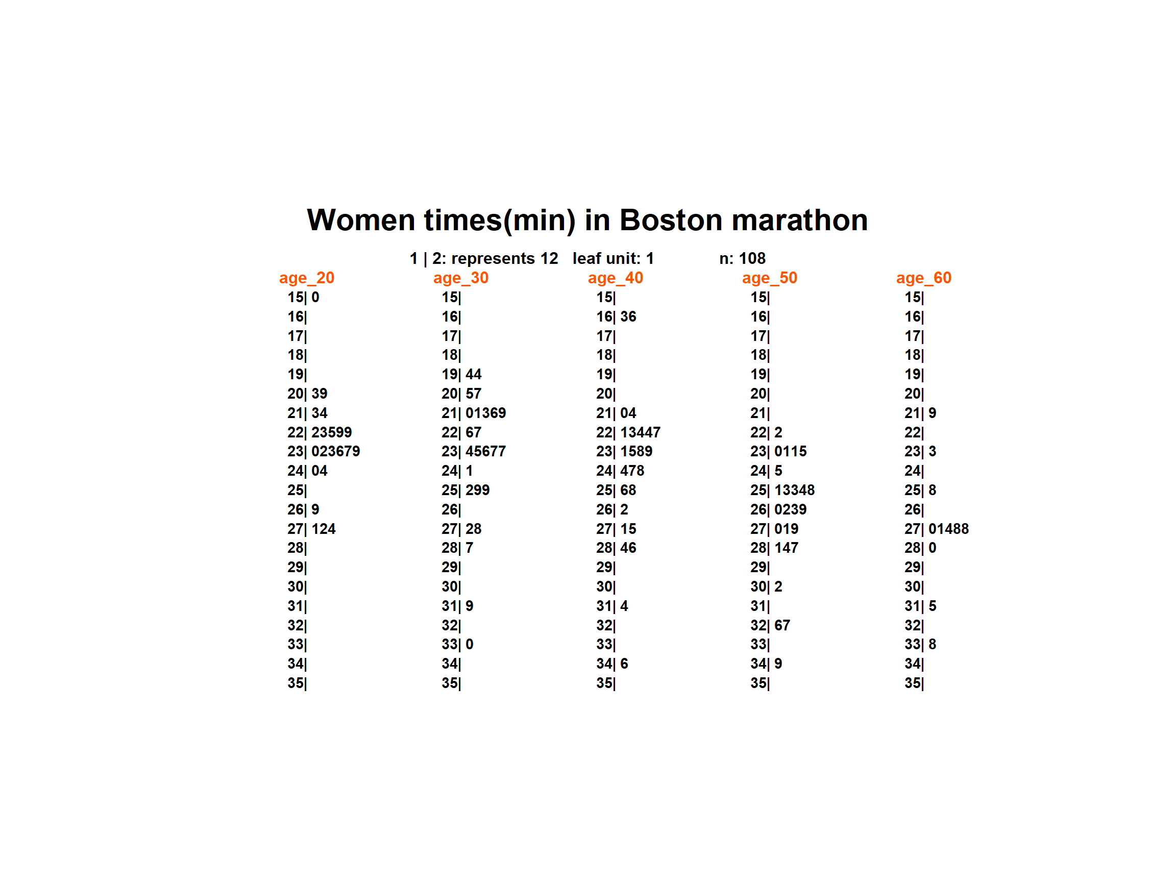
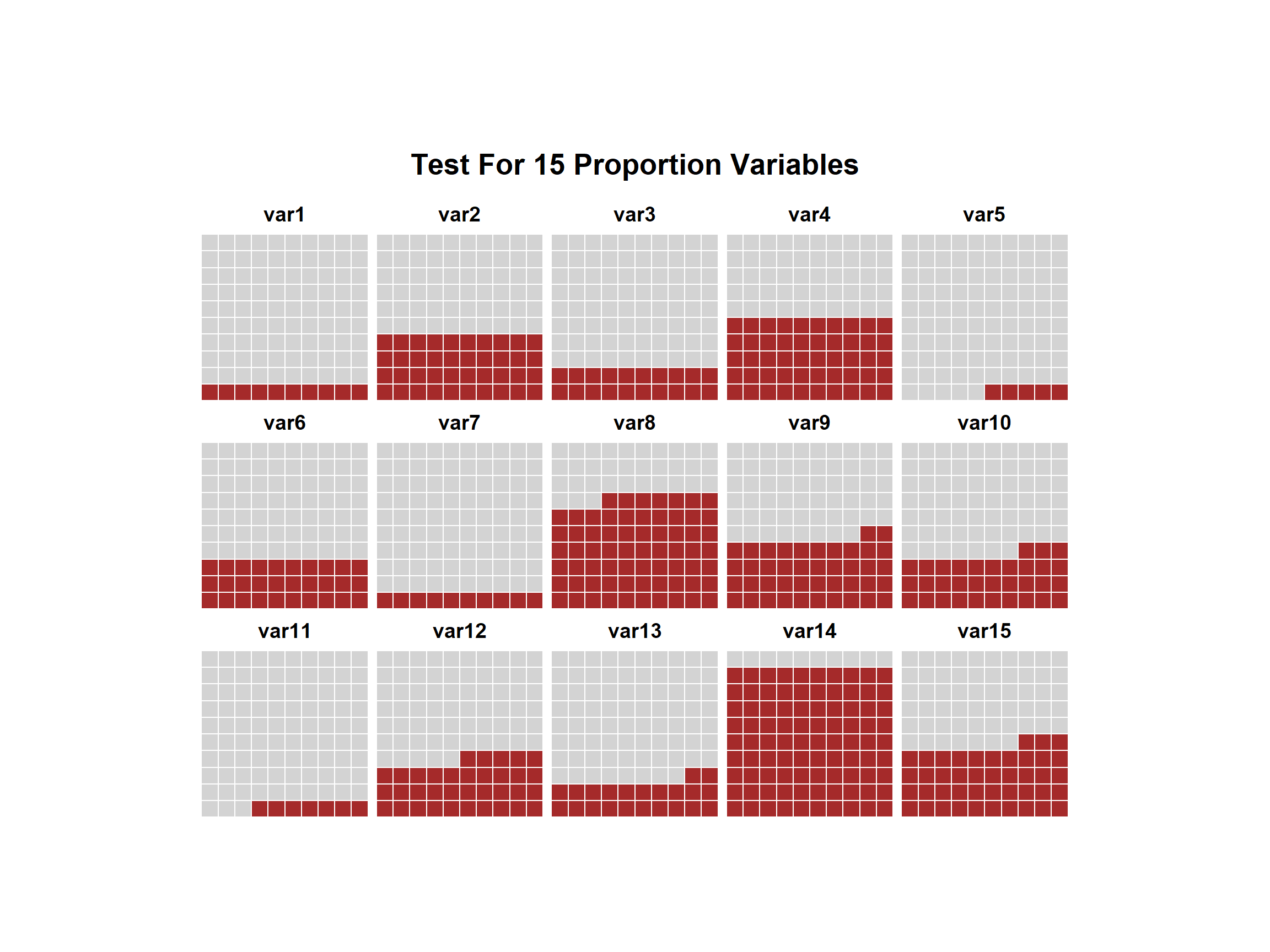
Also included with RplotterPkg are routines that are not always available such as spread_level, symmetry, stem_leaf, waffle, and multi-paneled plots. In the examples below we have a waffle plot of simple proportions and a stem_leaf plot comparing women Boston marathon times by age groups.
proportions_v <- c(
  var1=10, var2=40, var3=20, var4=50, var5=5,
  var6=30, var7=10, var8=67, var9=42, var10=33,
  var11=7, var12=35, var13=22, var14=90, var15=43
)

RplotterPkg::create_waffle_chart(
  x = proportions_v,
  title = "Test For 15 Proportion Variables",
)
marathon_times_lst <- list(
  "age_20" = RplotterPkg::boston_marathon[age == 20,]$time,
  "age_30" = RplotterPkg::boston_marathon[age == 30,]$time,
  "age_40" = RplotterPkg::boston_marathon[age == 40,]$time,
  "age_50" = RplotterPkg::boston_marathon[age == 50,]$time,
  "age_60" = RplotterPkg::boston_marathon[age == 60,]$time
)

RplotterPkg::stem_leaf_display(
  x = marathon_times_lst,
  title = "Women times(min) in Boston marathon",
  heading_color = "#FF5500"
)